
It should come as no surprise that the demand for mobile websites has grown exponentially over the past few years.
Most websites are now see half of their traffic or more coming from mobile devices like smartphones and tablets. Facebook for example has reported that almost 80% of its U.S. traffic uses a mobile device to access the site.
Google is well aware of these internet trends and has announced a major update to their search ranking algorithm coming April 21, 2015!
The big news?
If your website does not display properly across all devices – including tablets and smartphones – it most likely will lose value in search engine rankings.
That means you’ll lose search rank and all its associated website traffic (and leads or sales).
Google is providing some wonderful tools and resources to help webmasters and site owners get ready for the mobile site revolution.
Use their online mobile-friendly test to see if your website is ready for the new update.
If you aren’t then we suggest you take action today to avoid serious problems with your search rankings in the near future.
So what are your options to become mobile friendly?
Mobile friendly websites are built using one of two methods. They are built using responsive design or are built using a second separate website that is built specifically for mobile devices.
There are many discussions about which method is the best, but it seems that responsive design is winning the race.
In order to clear up any confusion we would like to explain the differences between responsive design and having a separate mobile website.
What is a stand-alone mobile website?
Prior to responsive design technology becoming available, website developers have been creating secondary websites that are built specifically for mobile devices.
They are typically a stripped-down version of the main site. These mobile sites usually have less content than the main desktop version of the site. These mobile versions almost always focus on emphasizing contact methods rather than delivering the total website experience.
One of the major advantages is development time.
This option is good for websites that need a simplified version to allow visitors to simply check the status of their order or confirm their reservations at the hotel, for example. There really is no need to have all the content of the main website on the mobile version.
One of the major disadvantages is the time and money spent maintaining two different website code bases.
If an update needs to be made to both the desktop and mobile version, then it will need to be made in two different code bases. A second disadvantage is that there are multiple URLs for what can be considered the same page. There are rumors that this may become a SEO issue in the future as search engines try to determine which URL to rank.
Below is a diagram that shows the basic infrastructure of how a separate mobile site works in conjunction with its main desktop version.

What is a responsive design website?
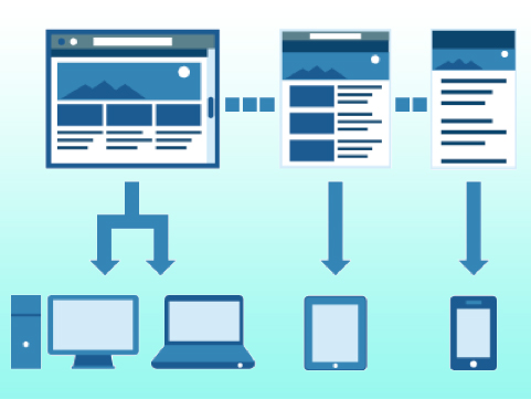
Responsive design is built using one code base of HML5 and CSS3 media queries.
Its fluid design can adapt to the width of any screen to provide a user friendly layout. The CSS code tells the device how to display all the content.
Certain elements of the website can be hidden or rearranged in order to make the layout look good. However, responsive design takes the assumption that all (or almost all) of the website’s content should be available on both desktop and mobile devices.
Here is a diagram that illustrates how one set of code is used to display a website’s content across different devices.
In comparison to a separate mobile site, responsive design does have one small disadvantage.
Initial development of a responsive site does cost a little more because it has to be built to interact with different devices using different operating systems. It also takes longer to build because the code needs to be written (or possibly re-written) so that it can take advantage of responsive design’s capabilities. Once the responsive code is written however, it is much easier to maintain as only one code source needs to be updated.
Responsive design has other advantages as well.
The most important advantage is that Google prefers responsive site design to having a separate mobile site.
It is much easier for Google to index your site when there is only one page URL. When a business has both a mobile site and desktop site, there will be a different URL and different HTML for each. This forces Google to crawl and index multiple versions of the same exact site.
Having just one URL also makes it much easier to share websites and content online. Why? Consider sharing a mobile site URL on Facebook or through an email. What if the recipient looks at that mobile URL on a desktop PC or laptop? That viewer would then be seeing a less than optimal site because it was intended for a mobile device which makes for an unpleasant viewing experience.
We are here to help!
Here at Right On – No Bull Marketing we are way ahead of the game. Our designers and developers are constantly staying on top of the ever changing world of Internet technology. We are well equipped to create great looking responsive websites that generate leads and sales! .
Here is a quick look at our latest responsive website design. If you would like to see more you can have a look at more of our work or give us a call at (602) 412-3168 for a free consultation so we can answer any questions you may have.
OnsiteGlassMN.com Responsive Desktop Website

Responsive Mobile (Same URL)